Tick chart vs candlestick chart on Deriv markets
Tick chart vs candlestick chart on Deriv: what each one shows, what each one hides, and when a trader is better off looking at one rather than the other.
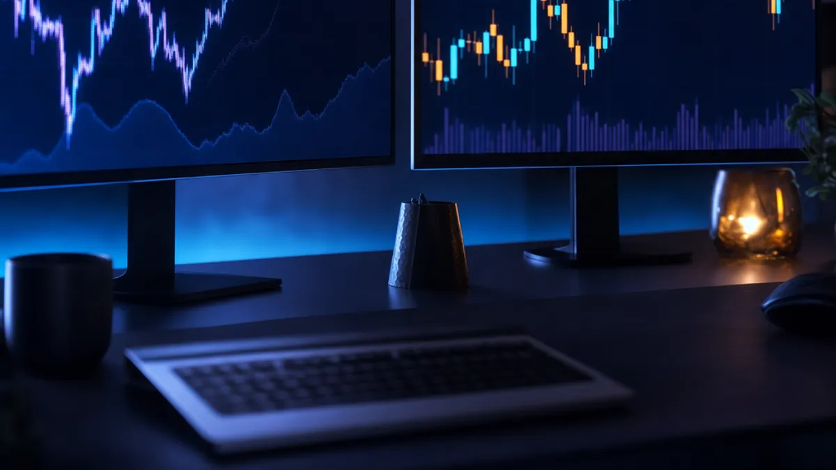
Tick chart vs candlestick chart is a choice between two ways of looking at the same price. A tick chart draws a point every time the price updates. A candlestick chart groups those updates into blocks of time and draws one candle for each block. Nothing is added and nothing is removed by switching between them. The market is the same. What changes is how much detail you see and how much shape you see, and those two things trade against each other.
This post explains what each view is good at, where each one misleads, and which Deriv contracts tend to sit with which chart.
A tick chart shows every update and nothing else
On a tick chart, one movement of price is one mark. There is no opening, closing, high or low, because there is no period for those words to describe. If the price updates slowly, the chart moves slowly. If updates come quickly, the chart fills quickly. Time is not evenly spaced across the horizontal axis. Activity is.
That is the strength of it. A tick chart is the rawest view of what is happening right now, with no averaging and no rounding into neat blocks. For contracts that resolve on the next tick or within a handful of ticks, this is the only view that matches what the contract is actually measuring. A candle covering a minute tells you very little about what the next single tick will do.
The weakness is also obvious once you watch one for a while. A tick chart is noisy. Every small wobble is drawn at full size, so patterns appear that are not patterns at all. It is easy to see a trend in thirty ticks that vanishes when you step back. Tick charts reward a short attention span, which is not always what a trader needs.
A candlestick chart compresses time into shape
A candlestick chart takes a fixed slice of time, say one minute or one hour, and reduces everything that happened in that slice to four numbers: where price opened, where it closed, the highest point and the lowest point. The body shows the distance between open and close. The wicks show how far price reached and came back from.
That compression is the point. By throwing away the detail inside each slice, a candlestick chart makes the larger structure visible. Ranges, levels that price keeps returning to, long runs in one direction, sudden expansion after a quiet stretch. None of that is easy to see on a tick chart, because the detail buries it.
The cost is that a candle hides its own sequence. A candle with a long upper wick and a close near the open tells you price went up and came back, but not whether it did so once, slowly, or four times in a scramble. For a contract that depends on the path rather than the endpoint, that missing sequence matters. You can see candlestick views alongside the Deriv markets on TradingView charts, which is where most structure reading gets done.
The two charts side by side
| Question | Tick chart | Candlestick chart |
|---|---|---|
| What is one mark | One price update | One slice of time |
| Horizontal axis | Activity | Clock time |
| Detail inside the mark | Nothing hidden | Open, high, low, close only |
| Good for | Very short contracts, last digit work | Structure, levels, direction over time |
| Main risk | Reading meaning into noise | Missing what happened inside a candle |
Which chart fits which Deriv contract
Match the chart to the thing the contract measures. That rule settles most of it.
- Digit contracts resolve on a single tick, so a tick view and the digit history are what matter. A one minute candle has no opinion on the last digit of the next tick.
- Rise and fall over a short tick count sits with a tick chart, because the contract is counting ticks, not minutes.
- Higher and lower against a barrier over a longer duration sits better with candles, because you are asking where price will be, not how it wriggled getting there.
- Forex pairs and gold are usually read on candles, since those markets have sessions and levels that only appear once time is on the axis. The contract types and the risks are covered in the guide to forex and gold with Deriv.
Synthetic indices complicate this slightly. The one second versions of the volatility indices update far more often than the standard ones, so a tick chart on a one second index fills the screen very quickly, and a one minute candle on the same index holds far more ticks than the same candle on the standard version. The chart label is identical. The amount of market inside it is not.
Using both rather than picking one
Most traders who settle this question end up using both, in order. Candles first, to work out what kind of market this is: quiet, trending, swinging between two levels. Ticks second, only once a decision is close, to see what price is doing at this moment.
Reversing that order is where trouble starts. Deciding on thirty ticks and then hunting for a candle that agrees is not analysis. It is looking for permission.
BancaBot's tools split along the same line. The AI Signals screen gives one read per market and shows the reasoning behind it, which is the structural view. The digit analyzer works at the other end, reading the last digits of the synthetic indices and showing one pick for the next tick with every card that led to it. Neither replaces looking at the chart yourself, and neither removes the risk. Trading loses money for many people, and a clearer chart does not change that.
What to do next
Open the same Deriv market in both views on a demo account and watch them for a session before you decide which one you trust.
Questions
Is a tick chart better than a candlestick chart?
Neither is better in general. A tick chart is better when the contract resolves in ticks, because it measures the same thing the contract measures. A candlestick chart is better when you want to see structure over time, such as levels and direction. The sensible approach is to use the one that matches what you are deciding.
Why does a tick chart have no open and close?
An open and a close only exist if there is a period to open and close within. A tick chart draws one mark per price update, so there is no period and no four values to summarise. That is why tick charts show a line or a series of points rather than bodies and wicks.
Can I use candlestick charts for digit contracts on Deriv?
You can look at them, but they do not answer the question a digit contract asks. A digit contract depends on the last digit of a single tick, and a candle reports only the open, high, low and close of a whole time slice. The digit history and the analyzer are the views that line up with the contract.
Do one second volatility indices change which chart I should use?
They change how much market fits inside each mark. A one minute candle on a one second index contains far more ticks than the same candle on the standard version, and a tick chart on it fills the screen much faster. Check which version of the index you are on before you read anything into the chart.
Trading on Deriv puts your money at risk, and automation does not change that. Practise on a demo account first and only trade money you can afford to lose.
Try this on your own account
Every tool in this post is free on a Deriv demo account. Log in with Deriv and nothing else is needed.